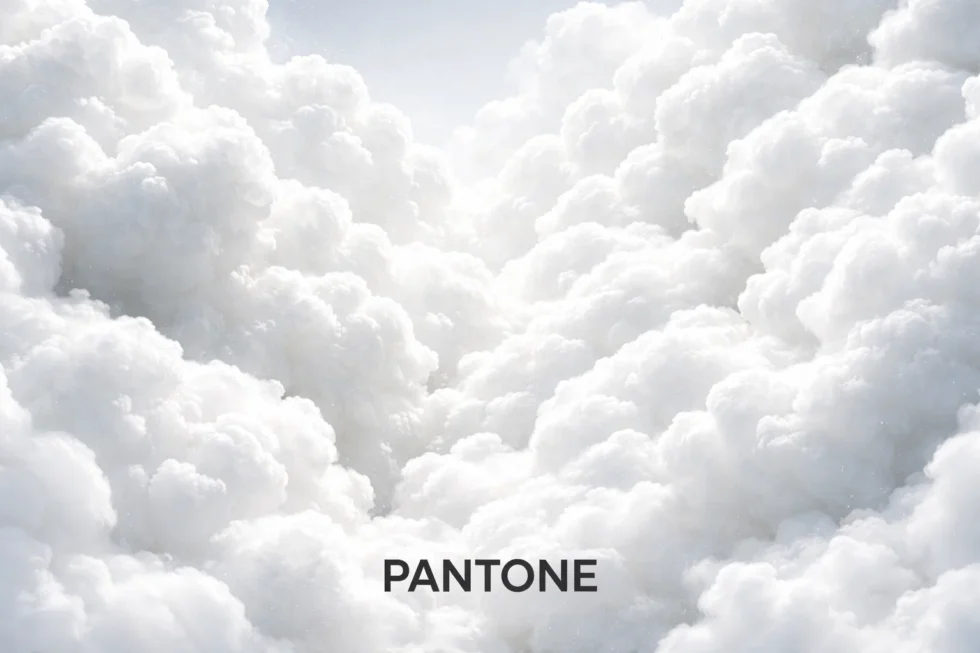
Pantone has named a shade of white as its Colour of the Year for 2026 — PANTONE 11-4201 Cloud Dancer — and the decision is already being interpreted not merely as a design choice, but as a cultural statement about where the world is heading. It is the first time since Pantone launched its Colour of the Year programme in 1999 that a white tone has been given the title, a move that signals a decisive shift away from visual excess. Pantone describes Cloud Dancer as a “lofty” and “ethereal” white whose soft, airy presence acts as a “whisper of calm in a noisy world”, designed to steady the eye and quiet the mind rather than stimulate or provoke. The WP Times reports, citing Pantone, that this choice reflects a growing global desire for clarity, emotional balance and visual restraint, framing 2026 not as a year of intensity, but as a year of reset — in which composure and understatement become the new form of confidence.
What Cloud Dancer actually looks like (and why that matters)
Calling it “white” is accurate, but incomplete. Cloud Dancer is not the harsh, high-contrast white of a hospital corridor or a bright LED screen. Pantone positions it as a soft off-white — light, slightly warmed, and deliberately non-clinical. In the official description, it is “billowy” and “ethereal”, a white designed to feel human rather than technological.
That nuance is commercially important. Pure whites can look cheap or aggressive depending on lighting and materials; near-whites read as premium because they reveal craftsmanship. On a runway, the difference is a matter of fabric and cut. In a living room, it is plaster texture, timber grain and the softness of shadows. A “quiet” white forces brands to compete on quality, not pigment.
Why Pantone chose white now: the logic behind the mood shift
Pantone does not pretend it is simply picking a fashionable colour. Its entire concept is that a single shade can capture the emotional weather of a given year — and in late 2025, the prevailing atmosphere is fatigue: information overload, AI-accelerated content, political tension, and a global economy that has made calm feel expensive.
Pantone frames Cloud Dancer as a symbol of “quiet reflection” and “calming influence”. The argument, at its core, is that the world is saturated — visually, psychologically, digitally — and that the next “trend” is not more stimulation but less. This is why the choice is more radical than it appears. A bold colour tries to take space. Cloud Dancer tries to give it back.
What Pantone chose before — and what it says about the times
Since launching its Colour of the Year programme in 1999, Pantone has used colour not as decoration but as a cultural indicator — a way of translating global moods, anxieties and aspirations into a single visual code. Each shade is chosen to reflect how societies are feeling about the future, from optimism and connection to fear, fatigue and the search for stability.
2025 — PANTONE 17-1230 Mocha Mousse
A rich, warm brown inspired by coffee and chocolate, Mocha Mousse was positioned as a colour of comfort and grounding. Pantone described it as evoking the pleasure of simple rituals — coffee breaks, warmth, tactile indulgence — in a world facing inflation, geopolitical instability and social exhaustion. The tone blended classic elegance with modern luxury, reflecting a global desire to retreat into familiarity without abandoning quality.
2024 — PANTONE 13-1023 Peach Fuzz
This soft, gentle peach tone represented human connection, care and emotional warmth. Pantone framed Peach Fuzz as a response to the psychological aftermath of the pandemic years — a colour meant to nurture rather than impress. It was described as enriching “the mind, the body and the soul”, signalling a cultural pivot toward empathy, softness and community after years of isolation.
2023 — PANTONE 18-1750 Viva Magenta
Bold, vibrant and slightly rebellious, Viva Magenta was presented as a “non-conventional red for a non-conventional time”. It combined warmth and coolness, energy and depth — mirroring a world grappling with rapid technological change, social tension and political volatility. The colour embodied resilience and creative defiance at a moment when certainty was in short supply.
Seen together, these colours form a narrative arc:
from defiance (2023) to healing (2024), to comfort (2025) — and now, with Cloud Dancer in 2026, to quiet and clarity. Pantone’s choice of white does not break the story; it completes it.
The technology angle: white as the colour of trust
There is a second force behind the choice, and it is not primarily about fashion. It is about interfaces. Over the last decade, white and soft neutrals have become the default language of products that want to signal clarity: fintech apps, health platforms, productivity tools and now AI systems. White communicates order. It implies neutrality. It suggests “clean data” even when the world is messy.

Pantone’s own product copy leans into this psychological positioning: Cloud Dancer as a stabilising background that reduces visual noise. In other words, the colour of 2026 mirrors the design grammar of the age: minimal, breathable, confident without spectacle.
How Pantone makes the decision (and why the industry listens)
Pantone’s Colour of the Year is backed by a global research process: tracking runway directions, interior design, art, advertising, digital culture and broader social sentiment. The brand then turns that judgement into a commercial “north star” that manufacturers, retailers and creative teams can point to when building ranges.
Pantone publishes the selection as both a narrative and a toolkit: official guidance, application palettes, and branded product lines tied to the Colour of the Year. That infrastructure is why the choice travels so fast — it arrives already packaged for adoption.
What changes in 2026: fashion, interiors, branding — and the “quiet luxury” effect
Cloud Dancer will not dominate because everyone suddenly wants to wear head-to-toe white. It will dominate because it works as a structure colour — a base that makes other design choices feel intentional.
Fashion: construction over colour
Designers will no longer rely on hue to create impact. Instead, they will compete on silhouette, tailoring and textile depth. Expect:
- monochrome whites broken by one strong texture (cashmere, denim, bouclé, leather)
- “soft uniforms” — minimal looks that read expensive because they are well made
- more attention to finishing, because white exposes flaws
Interiors: white that is not sterile
Cloud Dancer pushes away from sharp gallery whites toward warmer, light-catching neutrals. The result is rooms that feel calmer, not colder. It pairs naturally with wood, stone, brushed metal and black accents — a palette already dominant in high-end European homes.
Branding and packaging: trust, premium, permanence
White has long been a shortcut for credibility in healthcare and finance. Cloud Dancer extends that logic into luxury consumer space: skincare, fragrance, boutique food, tech accessories. The winners will be brands that use white as a material story — embossing, texture, matte finishes — rather than a blank surface.
The criticism: is white a cop-out — or a statement
The backlash began almost immediately, because white is easy to misunderstand. Some designers see it as conservative, even evasive: a retreat from plurality, colour and cultural specificity. Wallpaper* framed the debate starkly — is Pantone avoiding complexity, or offering a quiet emblem of hope?
But the controversy itself proves the choice is not neutral. If Cloud Dancer were truly “nothing”, it would provoke nothing. Instead, it has become a Rorschach test: people project onto it what they most want from 2026 — peace, clarity, control, renewal.
What this means for London’s luxury world
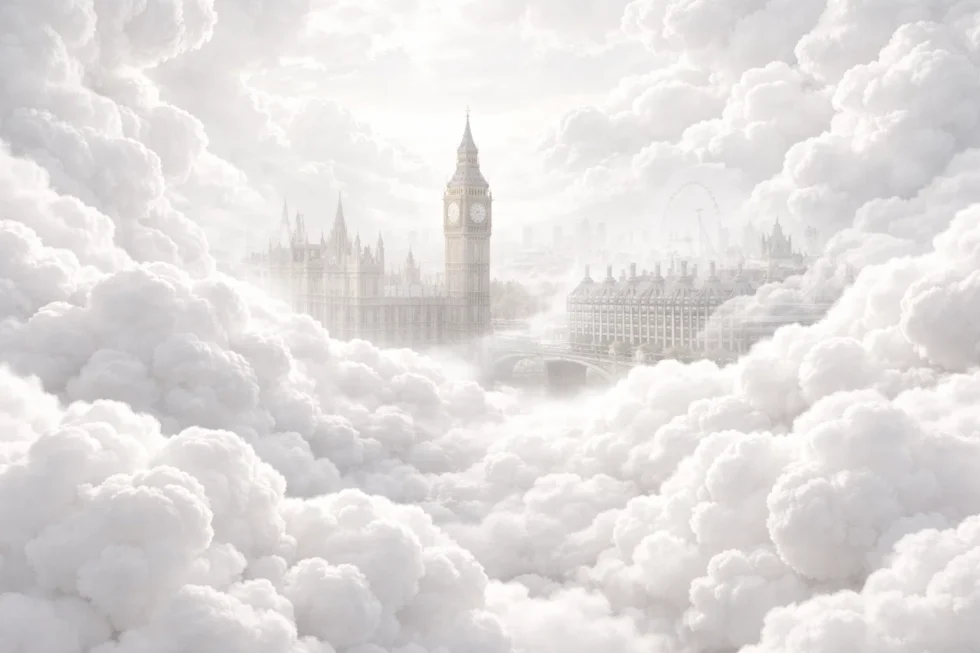
In London, Cloud Dancer lands at exactly the right moment. From Savile Row tailoring and Mayfair fashion houses to Chelsea interiors and boutique hotels, the capital’s premium market has been moving steadily toward quiet luxury — a visual language built on understatement, texture and restraint rather than spectacle.

For British luxury brands, Cloud Dancer offers the perfect platform: a white that does not shout, but signals confidence, heritage and craft. In a city where the most powerful statements are often the least obvious, Pantone’s Colour of the Year for 2026 speaks fluent London.
Pantone is not selling a colour. It is selling a proposition: that the next cycle of taste will value restraint over performance. Cloud Dancer rewards people and brands who can afford to slow down, who invest in materials and detail, who do not need loudness to be seen.
Read about the life of Westminster and Pimlico district, London and the world. 24/7 news with fresh and useful updates on culture, business, technology and city life: Stratford station safety: how a 72-year-old was struck 7 times by 4 Jubilee line trains on the London Underground